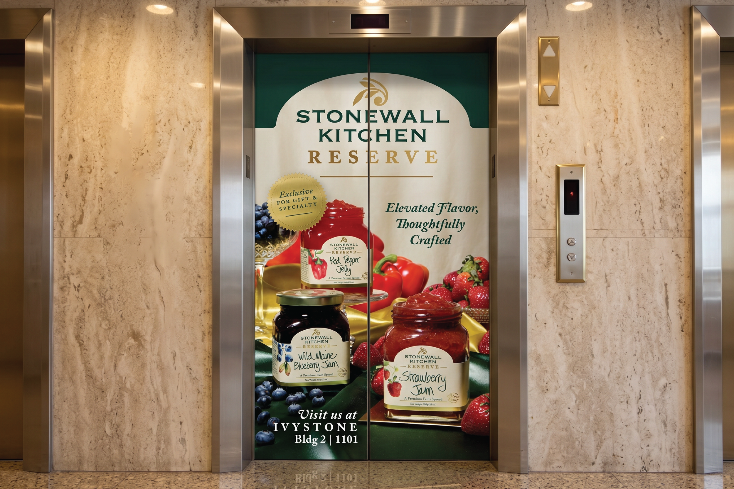
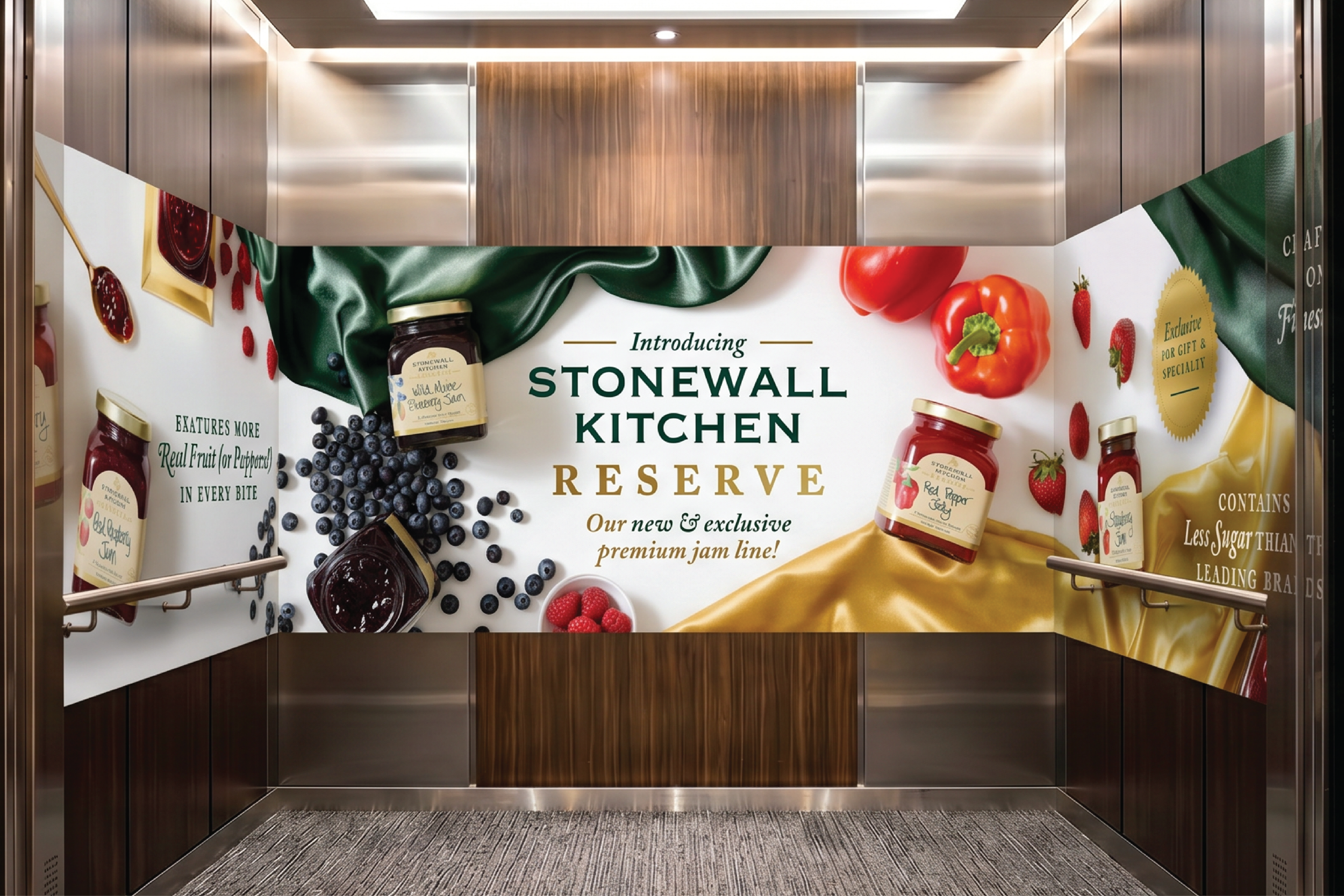
Stonewall Kitchen Reserve
A premium step up, without losing the brand's warmth.
Senior Graphic Designer & Brand Creative Lead | Packaging Design | Designed 2025 | Launched 2026
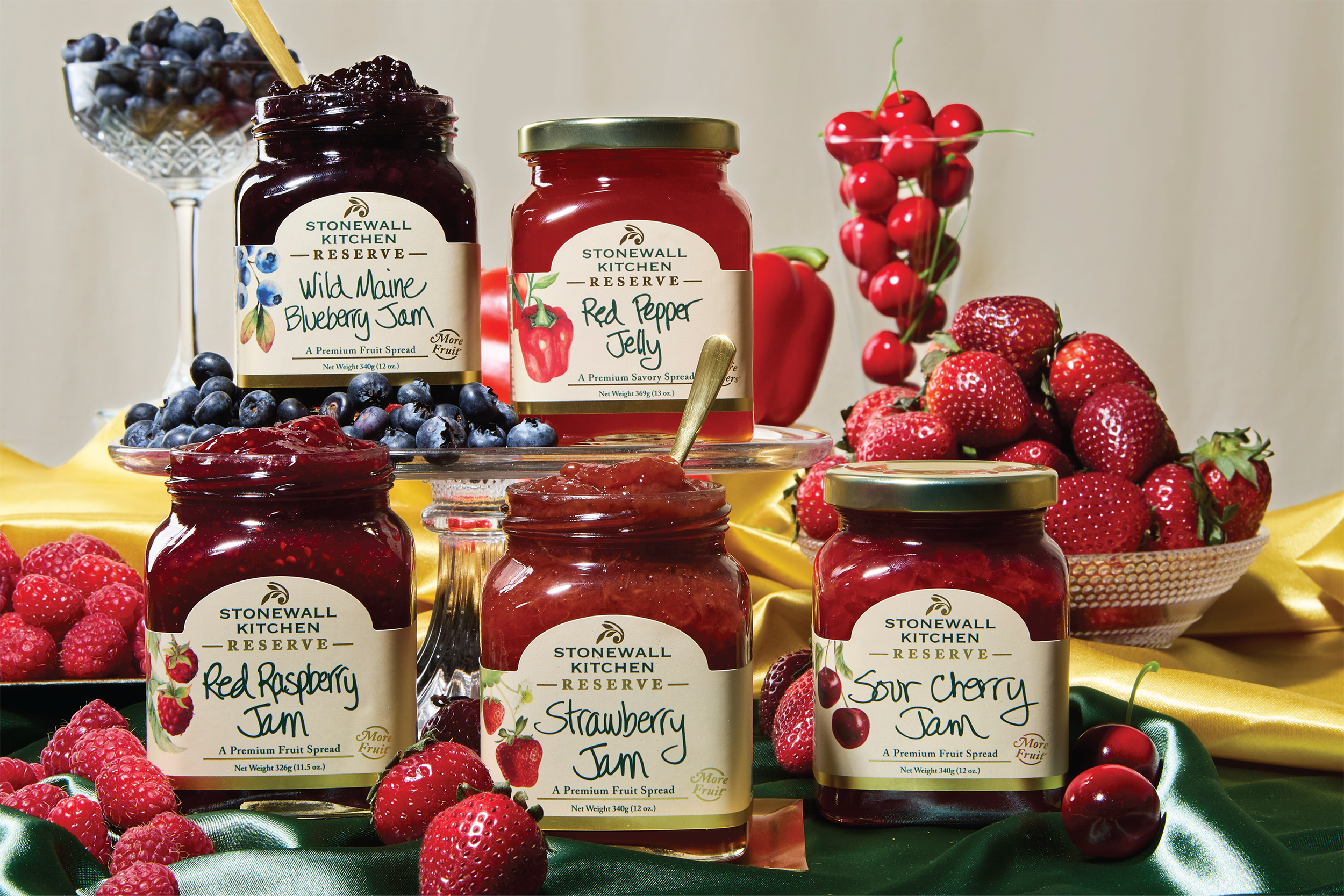
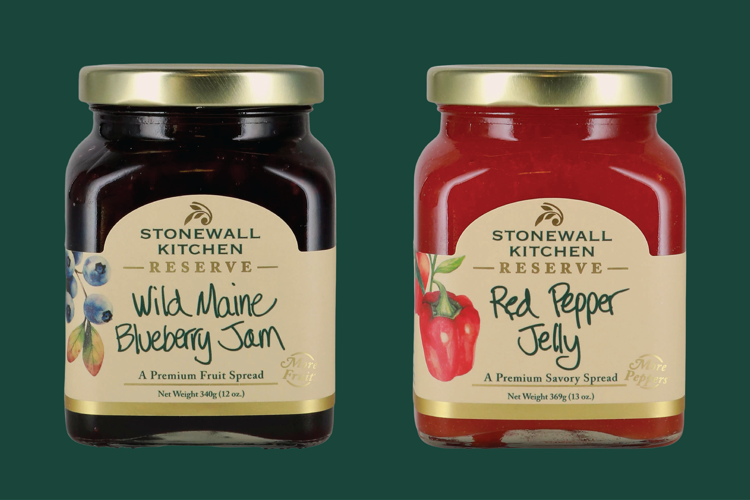
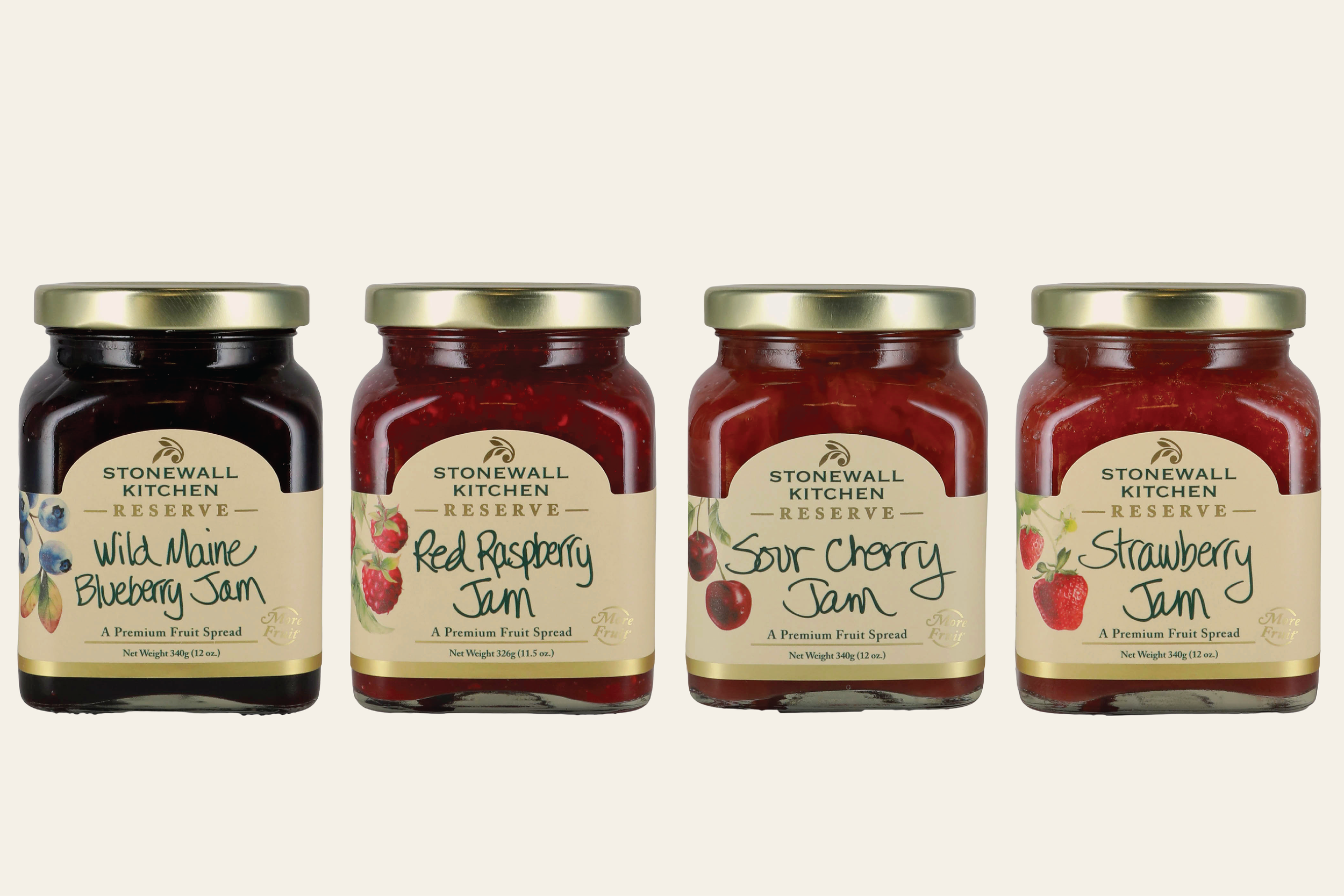
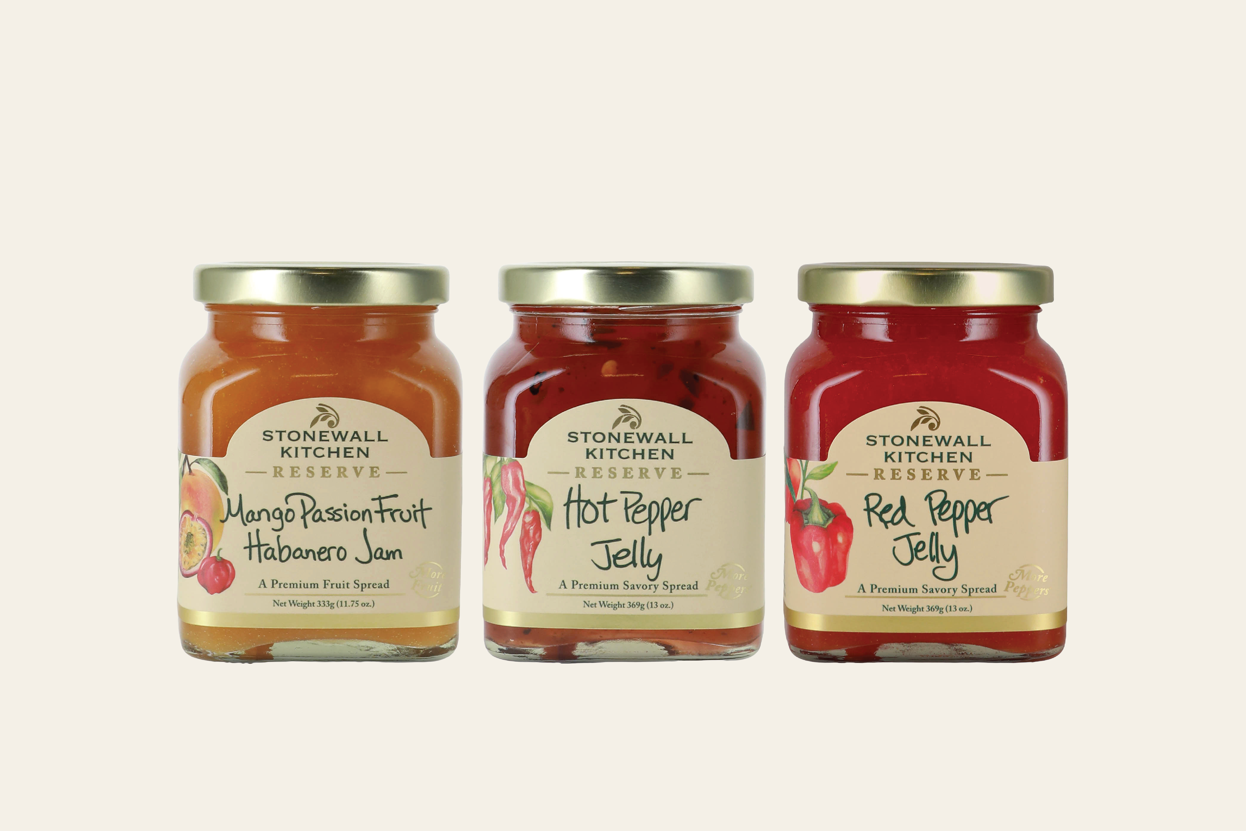
I owned this line end to end, from initial concept through final production. Stonewall Kitchen has always leaned fruit-first with less sugar than the leading brands, but Reserve pushed that further, "more fruit, less sugar" became the line's core promise. Showing the raw fruit itself, in soft watercolor, puts the ingredient front and center rather than hiding it behind ornamentation. I paired that with serif typography, gold foil, Jonathan King’s signature handwriting (of course) and a rustic, elegant restraint, since the system needed to read as premium without losing the brand's warmth. Each product carries its own specific claim, so the packaging needed enough flexibility to spotlight what made that jar special while reading as one collection. The line keeps expanding into new categories today.