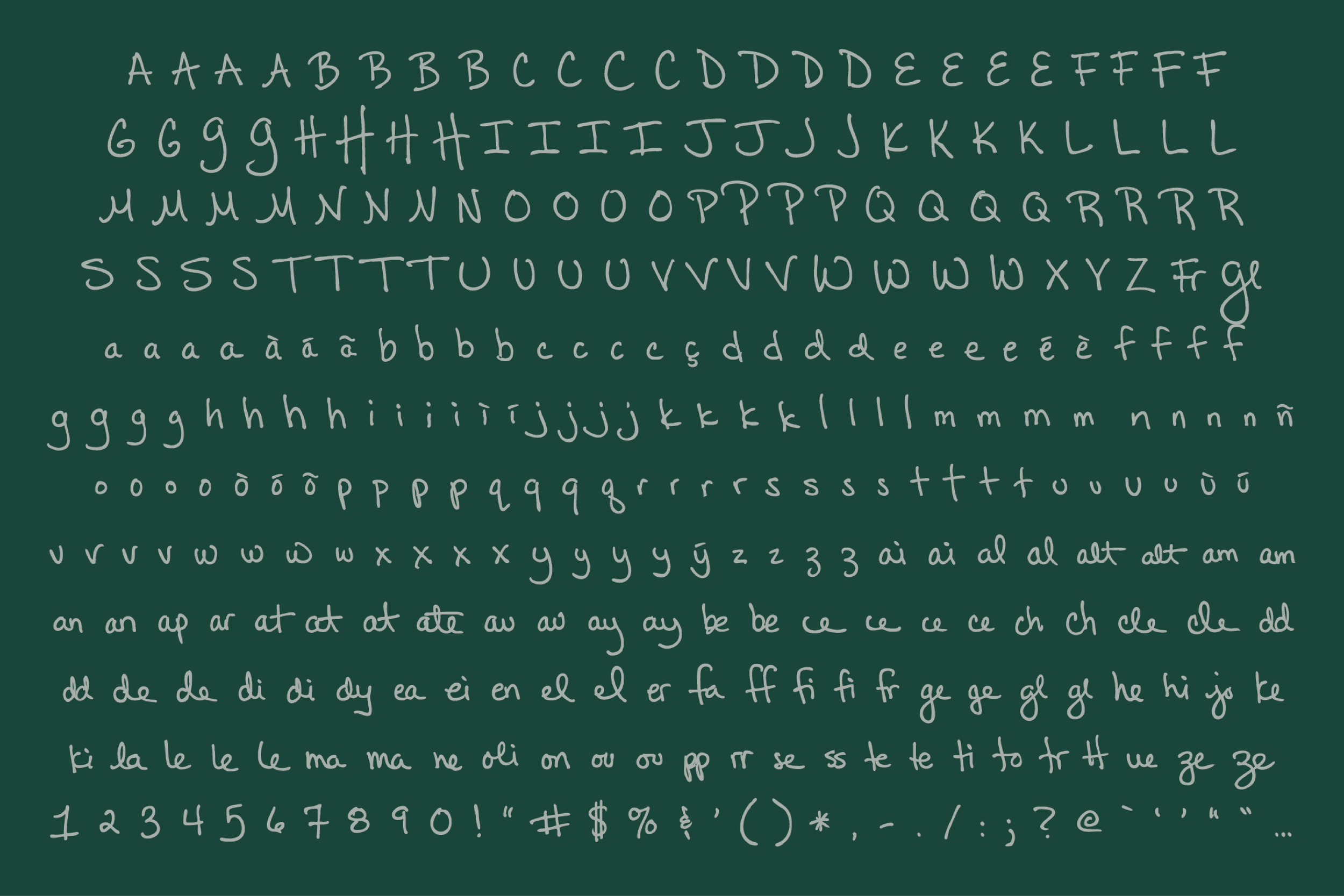
Stonewall Kitchen | Jonathan King Handwriting Font
A typeface built from a founder's own hand.
Graphic Designer | Typeface Design | 2012–2013
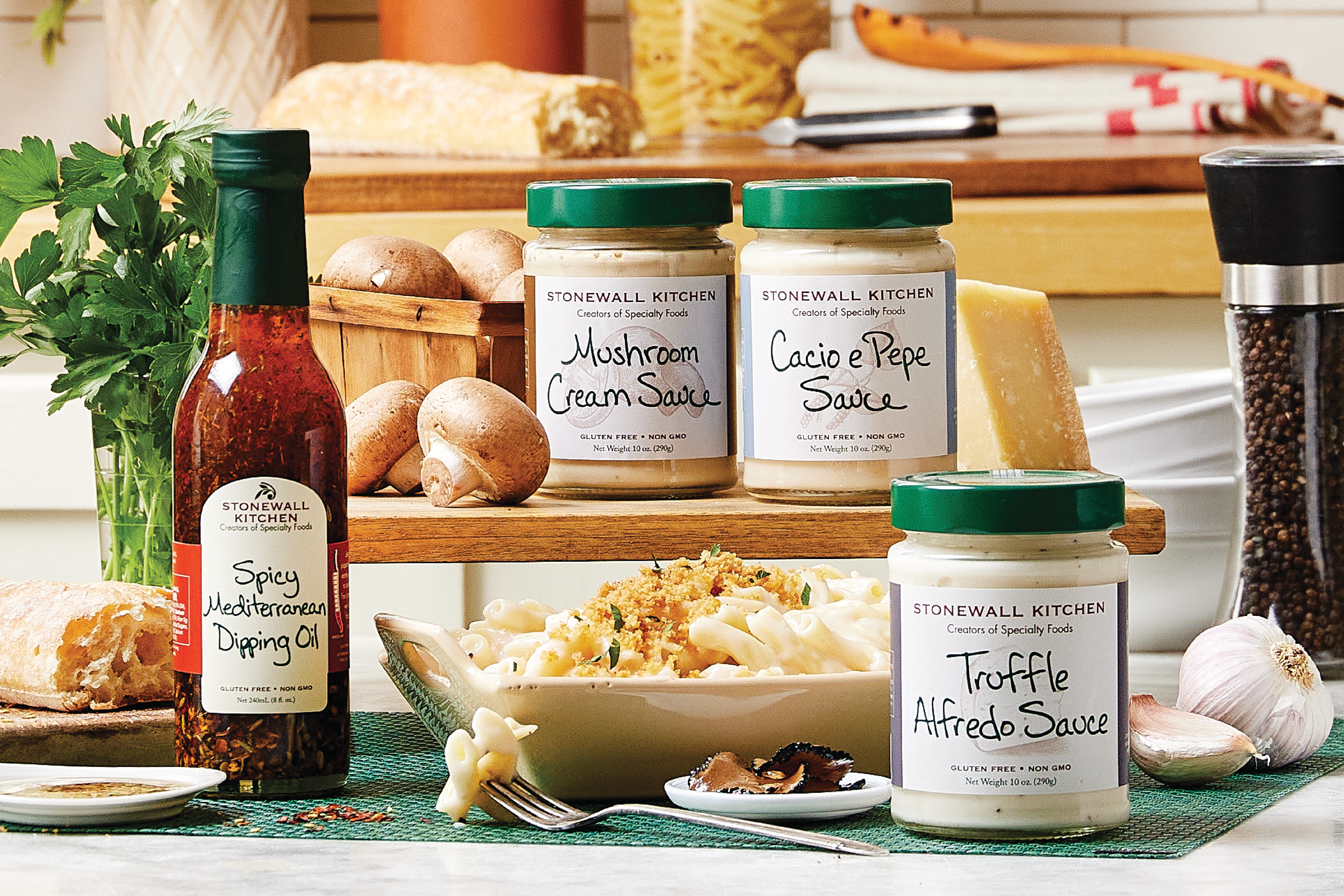
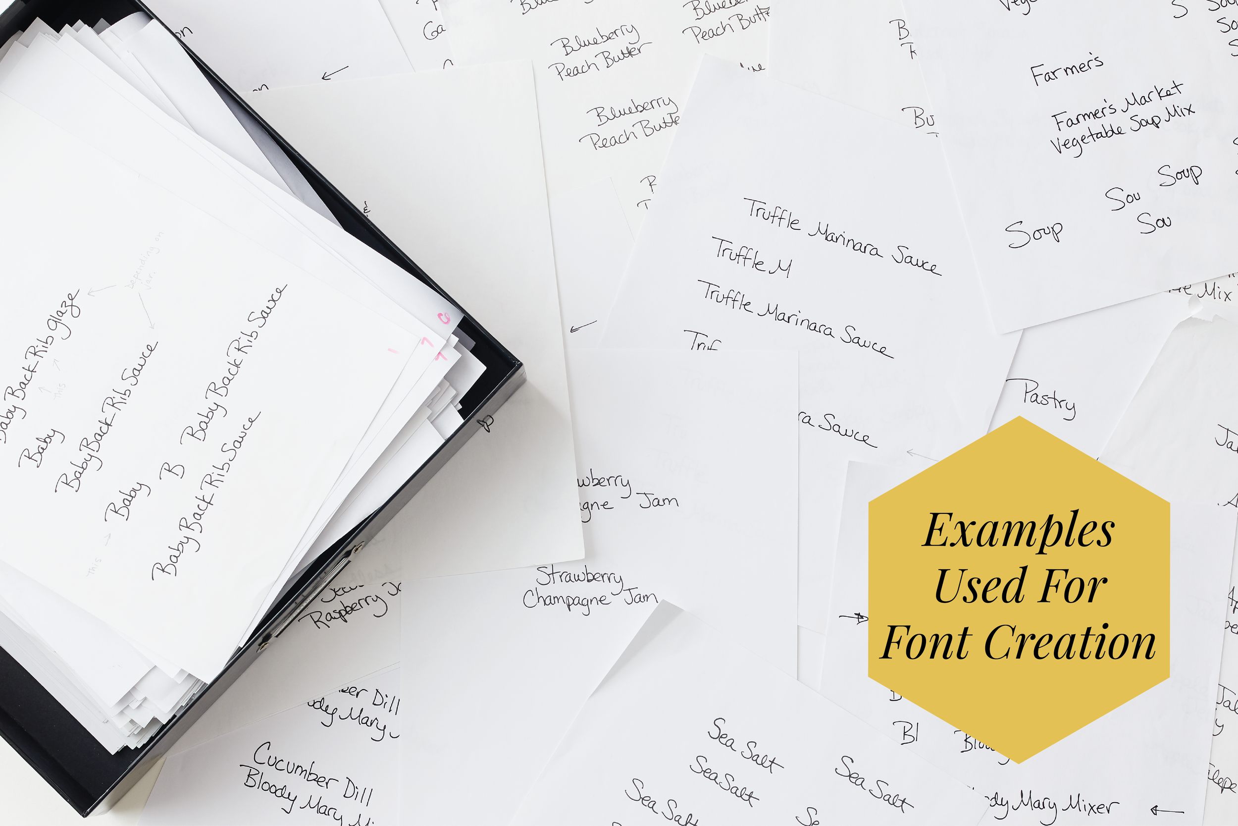
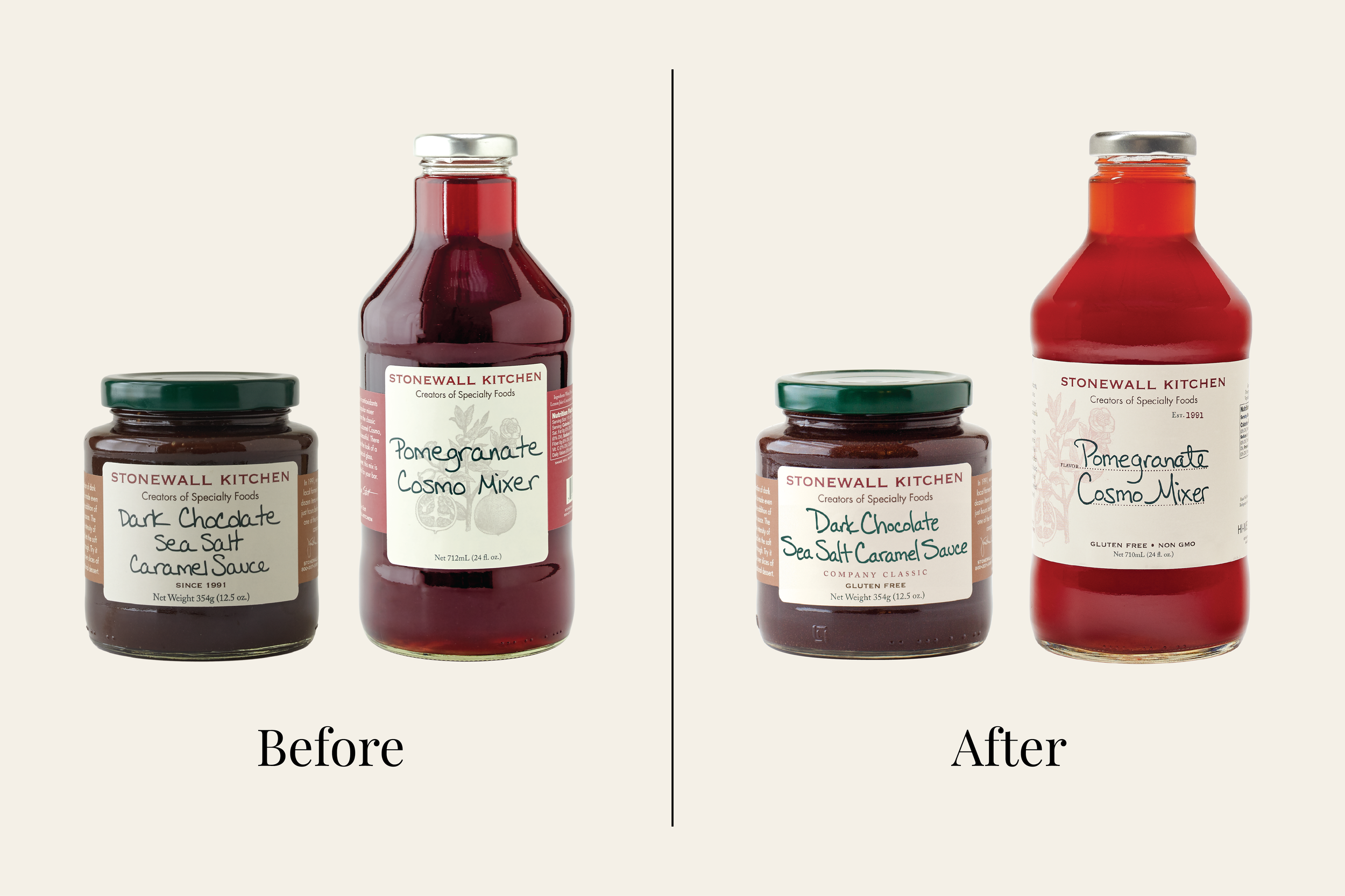
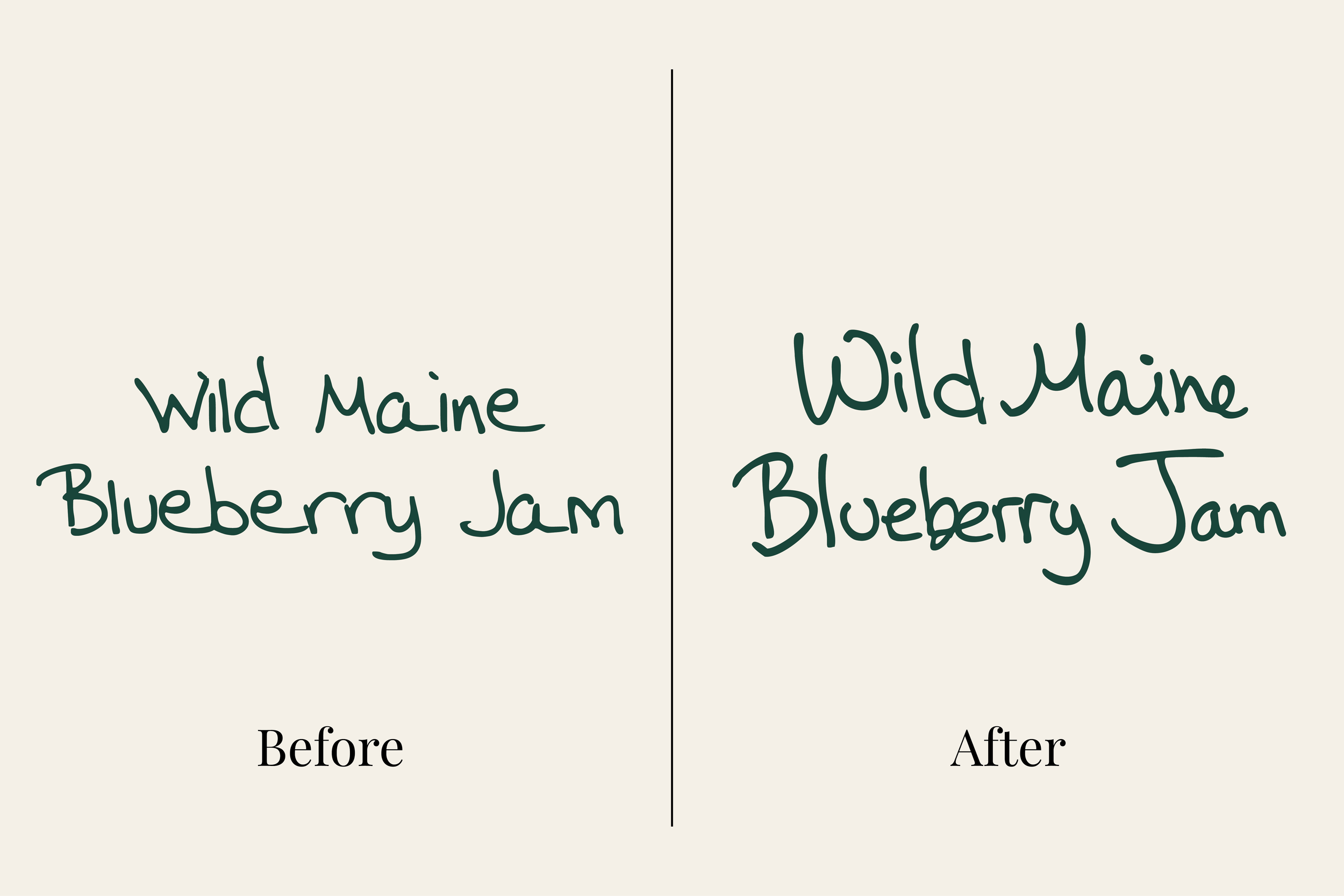
Stonewall Kitchen was built on the personal touch of founder Jonathan King, including his handwriting, which was scanned to every product name for years. As Jon stepped back from the company, I realized that the existing font was not up to the standards of the Stonewall Kitchen brand, nor did it speak to the individuality of Jon’s handwriting. I spent two years developing a custom typeface drawn from those original samples. I built the initial typeface in 2012, then reworked it in 2013 to better capture the feel of handwriting, adding glyphs and ligatures so letters could connect and vary the way they would on paper. The result was 200+ individual glyphs replicating the organic variation of his hand. What started as a way to preserve his presence became a core brand asset, now used across almost every label, package, and piece of marketing communication.